In what ways does your media product use, develop or challenge forms and conventions of real media products? (i.e. of music magazines)
The title of the magazine:
My title of my magazine (Beat) is short, but not too short. It has stuck with the convention of having a title that is not too long, that it needs shortening, as most magazine titles are either short or shortened e.g. NME and Q. I chose the title BEAT because of its reference to music, this was to show that my magazine it a music magazine, as the cover would not suggest that it was as model is not making any reference to music.
For the font of my masthead, I have kept it plain and simple as I think that it needs to stand out but not take over the whole cover page because during my research I had seen that the magazines that I had liked and taken inspiration from, had made the image a major part of the cover, not just the masthead. I used the font Letter Gothic Std because of its square-like nature, I think that as my magazine is quite clean cut, I needed a plain background that is "blocky" enough to stand out but it is not very thick, so it is not blocking the image much in the background.
Another convention I did not follow was having the masthead behind the model on the cover. I did not believe this to be very effective within my magazine because I didn't think that it would benefit from it. All that would be covered would be a little bit of the E and the A as my model does not cover the entire page. I think that having the mast head in front, but not covering the face ensures that the masthead is eye-catching but so is the face of the model.
Graphology/page layouts:
I have used a very clean cut page layout, which I think is consistent throughout my magazine. I have used the rule of thirds in my magazine cover to make sure that the image is central within the page. I have taken this idea from many magazines such as Cosmopolitan and Billboard.


For my contents page, by only using one column of text and a larger picture, I thought I was breaking the conventions of a magazine as a majority of magazines nowadays have either two or three columns and the pictures are smaller and they have more than one artist on them. Although, I have found quite a few contents pages from magazines like Spin and V who have also gone away from the conventions that I just mentioned.


Costumes, props, iconography used to reflect genre:
I have used a very clean cut page layout, which I think is consistent throughout my magazine. I have used the rule of thirds in my magazine cover to make sure that the image is central within the page. I have taken this idea from many magazines such as Cosmopolitan and Billboard.
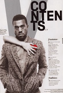
For my contents page, by only using one column of text and a larger picture, I thought I was breaking the conventions of a magazine as a majority of magazines nowadays have either two or three columns and the pictures are smaller and they have more than one artist on them. Although, I have found quite a few contents pages from magazines like Spin and V who have also gone away from the conventions that I just mentioned.
Costumes, props, iconography used to reflect genre:
With the styling within my magazine, I have gone for a very simplistic approach. I don't think there is a convention of styling within a magazine cover. Some magazines have very extravagant clothes posted on their cover whereas other magazines make it mostly about the face of their artist, not what they are wearing. I think I have followed this as I have made the face of my model stand out as much as possible by using quite simple clothes with not much colour.
Genre and how the magazine cover, contents and spread suggests it:
For this, I think that I have followed the conventions of most music magazines, in which they do not show that the artist on the cover is actually in the music business. Mostly women on music magazine covers pose in a typical photo shoot, this is to make them look more appealing and have the male gaze. I have followed this convention as my model is posing. All in all, this does not reflect the genre at all as there is no significance to music, but it is a convention of a music magazine I think.
Camerawork and framing of images:
For my camerawork I have made sure that my model is looking straight towards the camera. This is a convention of women photo shoots as it gives the photo the element of the male gaze. I think that it makes the photograph more inviting and interesting.
For the framing of images, in the magazines I have studied, I found that a lot of them framed the photograph in writing about the other artists featured in the magazine, where as I have created a line under my subheading and named a few artists that are featured. This then breaks this convention as I have not added anything onto the cover that describes anything in detail that is inside the magazine.
Title, article, header etc font and style:
For my fonts, I have chosen very plain and simple fonts for all of my contents page, cover page and double page spread. I think that this is because for this type of magazine, which has taken a simplistic approach, I do not think fancy writing would suit it.
For my masthead I chose to use Letter Gothic Std as this is a very plain writing that holds its own and stands out on my cover page.
Colour scheme:
I have used a basic colour scheme of red, white and black. This is sticking to the convention of having subtle colours that blend well together on all pages of my magazine.
I have used a basic colour scheme of red, white and black. This is sticking to the convention of having subtle colours that blend well together on all pages of my magazine.
No comments:
Post a Comment